Awards
What we did
When the team at NONOBJECT was tasked with developing a new water brand, there was little more than a large pipe in the ground.
The natural spring water, filtered through layers of limestone at a depth of 273 meters, requires no further filtering or chemical processes. It was an opportunity to establish a minimal but powerful product and brand, that was all about the purity of the water.
Staying pure
The client—who had previously established successful alcohol brands—wanted a water product that could be branded just as strongly and distinctly as luxury beverages, without the luxury connotations.

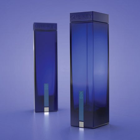
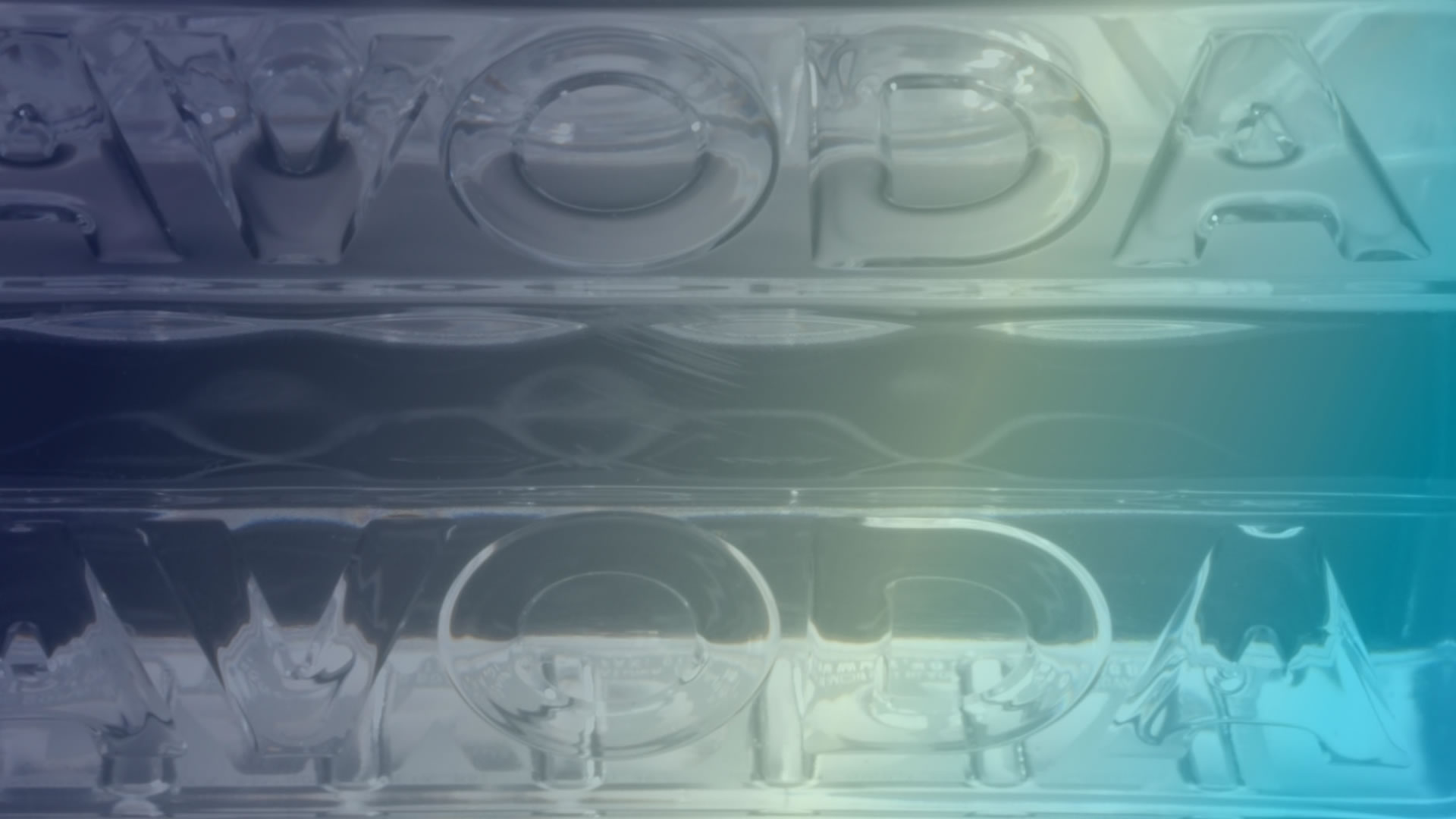
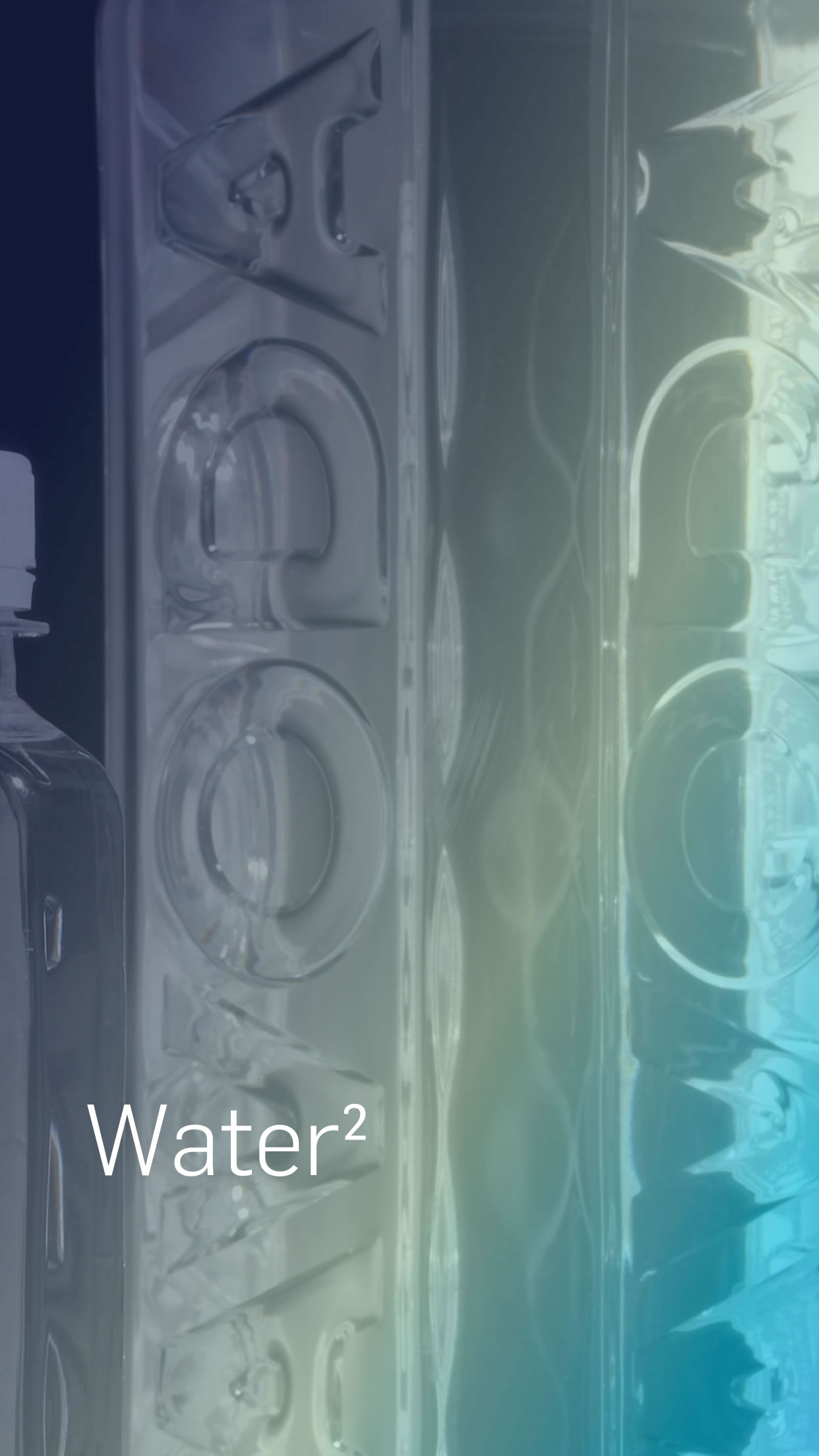
NONOBJECT designed a clear, square PET bottle with the product name molded in relief, and a clear label with only a white typographic logo. The simple white logo echos the clear nature of the water in the bottle, and departs strongly from the trend at the time of water brands using kitsch mountain scenes and blue-green landscapes. The bottle has a wide mouth opening, to replicate the refreshing and unlimited feeling of drinking from a glass.

Be square
The square PET bottle developed for VODAVODA was truly cutting edge. It was the first genuinely square bottle on the market. For the uninitiated, making a square PET bottle does not seem complicated, but engineers from the most-advanced, established bottle manufacturers had failed, ending up with square bottles that weren’t actually square, but rather bulging in the middle, more like barrels.
The problem was not just one of engineering. To maintain structural integrity, square bottles required the use of more material, which drives costs higher. And the VODAVODA design with the wide opening made it even more difficult to maintain structural integrity and keep material use down.


The innovative design by NONOBJECT leveraged existing knowledge but pushed beyond the perceived constraints, and the result was a truly square bottle that could withstand all the rigors and requirements of use, packaging and transport. VODAVODA also reduced costs of shipping by fitting more product into each carton, and more cartons into each container, resulting in substantial logistical benefits.

The universal appeal of clarity
VODAVODA quickly became a success, far beyond the reaches of its initial market. The clarity of the design and the attention to detail brought a small unknown brand to be prominently featured in Colette’s, and to land large orders from as far away as Japan, quickly doubling production.